Showing posts with label design. Show all posts

Coffee Propaganda! Cute Animation By Hyunji Aj Bae

on Monday, June 17, 2013

Coffee Propaganda from HYUNJI AJ BAE on Vimeo.

We love this retro styled animated short about coffee! Created by Hyunji Aj Bae, Coffee Propaganda  has been produced to mimic those 50's informative commercials whilst rocking a super cool space age theme with the cutest characters in town... what more could you want in life?
Follow us

Screengrab - Animation From Willie Witte

on Monday, June 10, 2013

SCREENGRAB from Willie Witte on Vimeo.

This short film by Willie Witte will bend your mind! It's an animation that uses screengrabs to show you that sometimes, what you see should not be believed. Really different way of working - we love it!
Follow us

The History Of Typography - Awesome Animated Short By Ben Barrett-Forrest

on Thursday, May 30, 2013

The History of Typography - Animated Short from Ben Barrett-Forrest on Vimeo.

This video by Ben Barrett-Forrest is not only super educational, but it's stop animation film style is totally rad. Learn in 5 minutes how typography began and how it's developed over time... if history lessons as cool as this at school, we would have paid much more attention!

Follow us

Alfred Shaheen & Hawaiian Fashion From The 50s

on Wednesday, April 24, 2013

One thing I know I'll be keeping a keen eye out for is some killer vintage Hawaiian shirts and dresses! You might not have heard of Alfred Saheen before, but you certainly know his work; he's the inventor of the infamous floral shirts! 


Alfred Shaheen was the most creative and prolific Hawaiian manufacturer in the heyday of post-WWII fashion. He pioneered Hawaii's vital garment manufacturing industry by stretching beyond the limits imposed by the isolation of the Hawaiian Islands. 

During pre-statehood Hawaii, a critical time in Hawaii's economic development, Shaheen built the most comprehensive textile printing, garment manufacturing, and retail company Hawaii would ever see. Shaheen accomplished this feat through his vision, inventiveness, engineering brilliance, and unreserved commitment to authenticity and excellence.


Like other Hawaiian manufacturers of his day, Shaheen's 'aloha wear' was originally made with textiles imported from the mainland. However, using these imported textiles had serious drawbacks and Shaheen soon realized that if he wanted to survive, he must find a way to create his own fabrics. 

Shaheen set up Surf 'n Sand Hand Prints, his first print plant and began scouring Honolulu's junkyards for parts to use in building his equipment. With two inexperienced local workers, Shaheen began building his machinery. 

By 1950, Shaheen had engineered and built his own machinery to print, dye, and finish his fabrics. By 1952, Shaheen was printing more than 60,000 yards of fabric per month and in 1956, Shaheen built an $8,000,000 factory, showroom, and office complex. By 1959 he had employed 400 people, sold garments worldwide, owned his own chain of retail stores in Hawaii, and grossed more than $4,000,000 annually. . . that's a lot of shirts!


Alfred Shaheen's textile designs and fabrics were inspired by Hawaii, the South Pacific, and Asia. He studied the native designs of these countries and adapted them to textiles, producing such classics as the Pua Lani PareauAntique Tapa, and Joss Sticks hand prints. His philosophy was to celebrate Hawaii's ethnic diversity and remain true to authentic cultural art forms.


Fingers crossed we can spy some of these beautiful garments whist on our travels. If I spot any of those 1950s dresses I'll be hocking all of my stuff to get it!

The Making Of The Artwork For "Born & Raised"

on Thursday, March 14, 2013

The Making of John Mayer's 'Born & Raised' Artwork from Danny Cooke on Vimeo.

This beautiful video shares how the album cover for John Mayer's "Born & Raised" album was made. If you love those old engraved windows that have gold lettering this is for you!
Follow us

Peek Inside Our Studio!

on Thursday, January 31, 2013

After hanging our lovely new Cable & Cotton lights and straightening up our studio, we thought perhaps you'd like to take a little peek inside Vivid HQ. As you can see, we like to keep things  colourful, fun ... and a little bit hectic!


We love to collect a lot of trinkets and treats as we find them really inspiring. Currently on my desk is our little piglet pal from Tokidoki and my favorite little Grumble Cave Monster. Who says toys are for kids? Oh! The giant bow has bubbles in it - a must have for avoiding work in style :D  Having a playful area is a great area to keep us motivated. Not all distractions are bad ones!


I took this photo of peanuts last year when I created my silver peanut pendant with Catherine Zoraida; Peanut is a nickname (I'm only wee!) I think they look amazing all lined up. Photographing your  favorite things is a great way to discover why you like them. That sounds crazy, but I swear it's not!
As for our lovely new lights, we had them custom made with those colours. I've been crushing on this combo a lot recently and couldn't resist adding them to the studio. I think I'm going to blog all about how you can do it too as they are so amazing! (read post here)


My big fluff jar full of pencils! These are two of my favorite things combined, and they work perfectly together :) I have a lot of these jars in my house as we love the font and the vintage styled branding - key things to Vivid Please! You may also notice a few sugar tins round here - another weird collection of ours - this one is particularly good as it's font is the same as our Vivid one! I love it when two things come together to make something spectacular!


Of course, here in Vivid HQ we have a lot of washi tape too... and this is only a small selection which are our current faves. I've hung them up to the left of the desk with a couple of cute paper straws and bakers twine for easy access. No studio is complete without some strange invention after all!

We hope you've enjoyed our mini studio tour and an insight into how we work... We hope it's given you a little inspiration to take into yours too :) Now, back to work!
Follow us

Style Crush: Laidbare Beauty Products

on Thursday, December 13, 2012

Today I thought I would share a little secret with you. I've just discovered Laidbare's incredible beauty products and I am in love!

It's not very often that I get excited about a cosmetic product, because 9 times out of 10, I'm left  disappointed. Never one to settle, I'll happily give everything a good go to find the one that's right for me, and trust me, I mean everything!

My new crush has come in the form of Laidbare. I discovered their products in a department store recently and I have to admit it's possibly been my best find all year. For me, taking care of my skin is really important, especially during winter as I find the cold dry air particularly effects me... and, of course, there is no better feeling than some pampering when it's snowing outside!


So, what's all the fuss about? Well, to start with, all of the products in the range are 100% natural. I find that the ones pumped full of chemicals tend to be rather undesirable. I had a shot on some of Benefit's new moisturizer, which although looks a treat, cost quite a lot of money and left me with a horrible taste in my mouth - literally. Ok, ok, I know you're not meant to eat the stuff (which I didn't!), but when moisturizing I do include my lips in the process. Perhaps that's not normal, but I think it's important, and I think that a moisturizer should be able to cope with it. Unfortunately I could taste chemicals all day, which is not only disgustingly unpleasant, but left me pretty concerned about what I was putting on my skin! If it's not natural, it's not worth it if you ask me.


I find that whenever I want to buy a completely natural product, I'm usually disappointed with the packaging and branding. As you will have noticed from our blog and shop, branding is really important to us. We're designers and we like to fill our lives full of good looking items; it may sound shallow, but I bet it's more important to you than you think.
Hands down, Laidbare is the best looking product on the shelf. It's clean and simple with a beautiful typeface and its 50/50 colour brings a Damien Hirst tear to my eye. With cute names like "Working 9 to 5", "Butter Me Up" and "DIY", you know for sure that I am in heaven!
I certainly don't feel like an old maid carrying this cream in my bag :)


Looks aside, I'm delighted to share that the products are great too. I've been using them for a while now and not only has my skin cleared up and become silky soft, I smell delicious too! My favourite products form the range are the body butter, cleanser and toner and moisturizer...

The body butter "Butter Me Up" has the most beautiful smell of bergamot (one of my favourites!) and has hints of jasmine and patchouli in the mix too. It smells really luxurious when you're putting it on and the scent lasts for hours, which is incredible for a natural product. It takes a few seconds to massage it into your skin, but the results are simply devine; my skin is soft and the boyfriend is a fan - what more could a girl ask for?!


I'm a big fan of the two in one Clenser & Toner "DIY" as it get's the job done fast and extremely well. Being party season, the last thing I want to worry about is spending ages trying to take my party face off before bed, and the state my skin is going to be left in the next morning. Combined products are the way forward! Not only has my face cleared up (I get spots around my mouth), but this stuff smells like my favourite party treat; lime jelly! I swear, it takes years off you in mood and ageing :D

Last, but certainly not least, is the all important moisturizer. "Working 9 to 5" is an anti-aging hydration cream that is bang full of goodness; you wouldn't want anything less for your most important feature! The cream is like a second skin which is ideal for that cold, dry air that is super tough on you're skin at this time of year. It has a light rosewater scent (which alway's steals my heart), and is not only great at making your skin look radient... I'm delighted to share that it's taste free too :D


So ladies, I hope my little discovery and insight has helped you in your search for your perfect beauty product :) My skin is soft and clear... and most of the products cost less than £10! It's going to be difficult for Santa not to pick up a couple of these for me this year ;)

Here's to starting 2013 looking as good as we feel!

Happy Pampering!


A Vivid Please Makeover!

on Tuesday, June 12, 2012
Hooray!
It's live!
After a lot of planning, tweaking, testing and general playing about, our shiny new blog is good to go!

We have geared this redesign around making things easier for you, our lovely reader, to navigate, read, contribute and keep up-to-date with what we are doing.

There is still more to add in days & weeks to come, but in the meantime keep an eye out for any little bugs or funny bits. We would also love to hear what you think of our lovely new look, so please leave us a comment with your opinions!

We hope you love it as much as we do :D
Enjoy!
Vivid xox

Follow us

Blog Re-design In Progress!


We're saying farewell to our current blog look today!
That's right, we've been working like busy little bees on our new design and can't wait to finally share it with you :D So, please bare with us today as we will be fiddling with the outlay. Don't worry, we will be back in no time at all!
Goodbye old layout, you've done us well :D


Product Packaging: Which Do You Prefer?

on Friday, April 20, 2012


Hello lovelies!
Today we are asking for your help...
Last week we introduced you to our new biscuit ornaments. Made out of plaster and displayed on raffia, our afternoon treats seem to have gone down well... However, we can't quite decide which packaging we prefer. So we thought we would open up our discussion to our favorite people...  You of course! 
Your thoughts and opinions are really important to us and we were hoping you would be able to help us finish off this product properly :)


So, simply put, which packaging is your favorite?

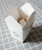
Is it the white Chinese take out box? We like it because it is so clean and simple; really minimalist and playful. It is easy to pack up and hand out (very market stall friendly) and we love it's kitsch factor. The surprise you get when opening it up is awesome too :)

Or is it the 1/2 pint berry box? This beautiful teal box is super farmers market chique... It is eco friendly as it is made from recycled pulp and it is so perfect and pretty you could put it straight on your  dresser :) But as it is so open, packaging this one up at a market would prove quite the challenge at speed..


Or perhaps you think we should only sell take out boxes at markets and berry boxes online?

As you can see, we are in quite the pickle over this one... they're both pretty cool and we just can't make up our minds!

What would you do?

Thanks for your time and help peeps!

Abandoned Artworks By Lori Nix

on Monday, April 16, 2012


We are in love with Lori Nix and her incredible images of abandoned places!


From salons to launderettes, bars and offices, stores and libraries, these photographs of hauntingly empty and destroyed places have us mesmerized. So calm after the chaos; just fascinating!


But these images are not what you would expect at first glance.
They are actually dioramas! Yup, Lori has painstakingly made each and every one of these beautiful spaces herself, and each one takes around 7 months to make. Crikey!


Talking of her work and inspiration, Lori explains 'It takes about seven months to complete a diorama, but I'm working on two to three at a time. I make about three new images a year if I'm lucky and focused.' 
'I grew up in the middle of the United States, in a town called Norton, Kansas, which is in the middle of nowhere. The only thing that happens there is extreme weather. As I child I experienced tornadoes, floods, blizzards, and seasonal insect infestations. This has led me to explore the notions of danger, disaster and ultimately apocalyptical imagery. I also grew up in the 1970s, a time when dystopian cinema was at its zenith. As a six year old, I remember watching movies such as the Planet of the Apes, Towering Inferno, The Poseidon Adventure, Soylent Green and Logan's Run. These movies had a profound impact on my world outlook. I've taken my experiences with weather, combined them with my memories of these movies and have created the photographic series The City. Living in New York City has led me to appreciate incredible architecture, especially interior spaces. All of these inspirations have come together for this series, a photographic project I began in 2005 and continue to explore.'


Crazy impressive, right? Lori has opened up a whole new world of inspiration for us. It's great to see how watching films and having crap weather all the time can influence your work in different ways. We would never have imagined creating something as awesomely epic as these masterpieces! 

If you love Lori Nix as much as we do, click the link to check out her website. Any lucky readers based in Toronto, Canada will get the chance to see some of her work exhibited this summer. Lucky beans!
Enjoy :)

Up There: A Film About A Lost Art

on Monday, March 26, 2012

This mini documentary shows the lost art of painting adverts outdoors. It's one of our favourites as we think the world needs more public installations like these. It's only 12 minutes long, so be sure to watch it and spread the love...

London Fashion And Textile Museum: Designing Woman - Post-War British Textiles

on Monday, March 19, 2012

The London Fashion And Textile Museum has just opened its latest exhibition featuring textiles designed by women after the war. Being big fan's of design from this period, we are itching to go to this show!


During the 50s and 60s, Britain was at the forefront of international textile design, and with designs like these it is not hard to see why. We have three pioneering women to thank for such fab prints and patterns after such a dull and drab time; Lucienne Day, Jacqueline Groag and Marian Mahler. These lovely ladies broke down boundaries and made the world a much more beautiful and fun place to be again. 
Thank goodness for that!


Showcasing their work and featuring more than 100 pieces designed during this period, we are sure this exhibition is going to be packed out with retro fans and vintage addicts looking for some inspiration for their homes and their wardrobes...


We are super proud of our heritage and are ecstatic to announce that we have been asked to stock our retro stationery for the duration of this show too! 


That's right, our polaroid note cards will be available in the London Fashion and Textile Museum shop until the 16th of June. We are pretty speechless about how proud we are to be able to get involved and spread the love of the fifties. What an honour!


Check out the London Fashion and Textile Museum website to find out more details of the show and be sure to check out Design Week's review here... 


Enjoy!